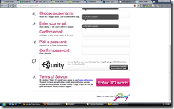
Looking at the screenshot below, you will be wondering why is this post titled “An example of Bad Design”. After all the design looks fine and elegant.
A wise man once said, “looks can be deceiving” and rightly so in this particular case. While the visual design of this page from the site gojiyo.com seems nice, it is the interaction design which fails. You are asked to choose you username, fill your email address and select a password, which you do. But post that you are asked to install the unity3D plugin and are given a button to download the plugin. Clicking on the button takes you away from this page and into a unity page where you can download the plugin. But what happened to the sign up process. Was that completed? NO!
If you are engaging the user in a flow, you should ensure that the flow is completed. What if I start downloading the plugin and then completely forget about why I was downloading it. It is, after all, an era of short attention spans. In this case the download link should have opened in a new window or perhaps better still it should have appeared after the sign up process.
What do you think?

No comments:
Post a Comment