Over the last 3 years, my gmail address has become my primary email address. I hardly log into my yahoo mail address anymore, maybe once a month. My Yahoo address used to be my primary email address. So why did I stop using Yahoo mail. Well essentially because of two reasons.
1) Search - The search feature of Yahoo sucked. I found it difficult to locate mails which I knew were there in my Yahoo inbox. I found gmail search easy and effective.And slowly I stopped giving people my Yahoo address. I stopped checking my Yahoo mail.
2) Spam - Perhaps the spam filter of gmail is more effective. Or perhaps Yahoo being the number 1 site a few years ago attracted more spammers. I don't know but my Yahoo mail always had more spam than meaningful email.
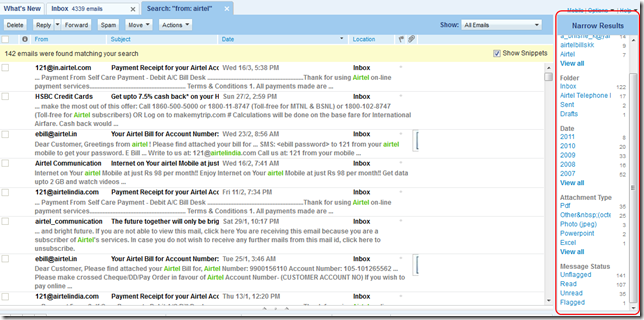
However, today I had to log into Yahoo mail to find and sort some important mails which I do receive on my Yahoo address. I don't know why but I just tried the search term that I would have tried in my gmail (from:emailaddress) and voila.. it worked. Perhaps this feature has been there for long and I did not know. But this really made my life easier. And now comes the best part.
On the right hand side, a small search options pane opened up giving me very useful options to narrow down my search to the relevant mails. Check out the screen shot below(click on image to view in full size):

These options were super useful. I specially liked the attachment type option as I was looking for a pdf and I knew it was sent sometime in 2009.
All may not be well at Yahoo but this feature sure rocks! Yahoo might just have regained a bit of its lost mojo.
